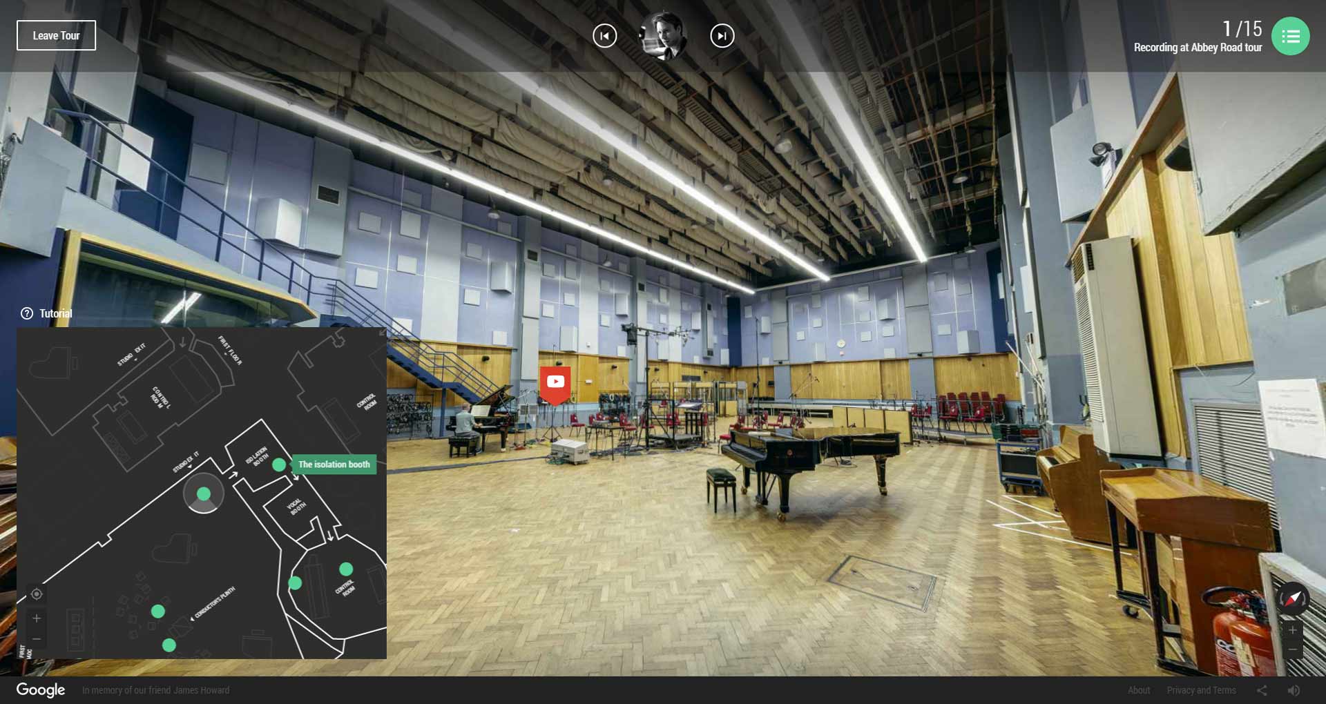
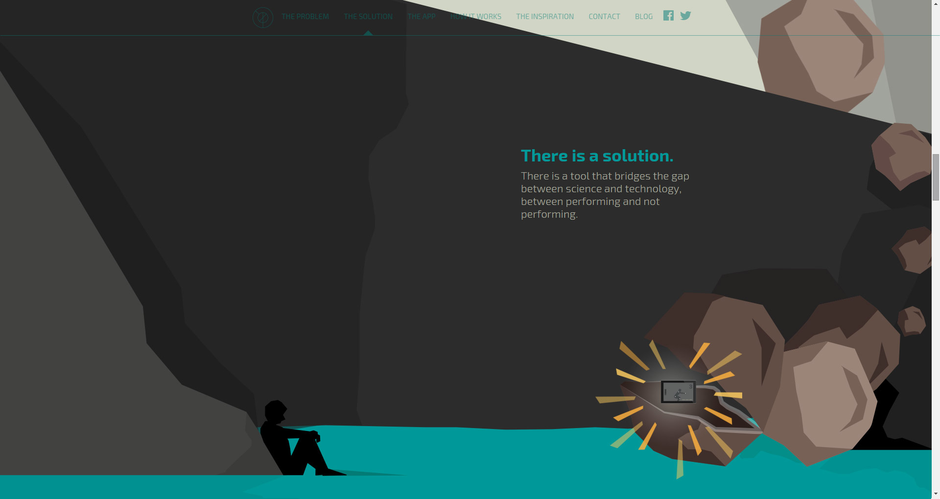
We take a lot of pride in our design work. A pride we don’t take lightly. It was manufactured by countless hours building designs for websites, apps, motion graphics, and print as well as a dedication to find what inspires us in life. Weekly, we read blogs, follow other designer’s work, learn about fashion, and even rewind and watch commercials on TV a second time (To only partial annoyance from the girlfriend).
Being inspired and then sharing inspiration with the team keeps our work fresh and pushes our designs beyond comfort to much greater levels.
We’ll continue to find inspiration in the world and in doing so ensure we’re always on the cutting edge of the techniques and trends of design.
What are the trends?
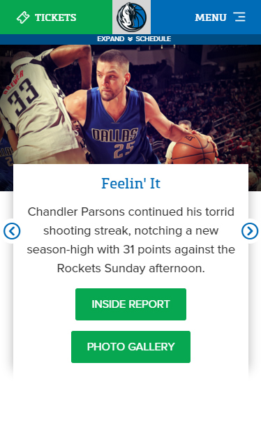
Most of what we’ll be seeing in 2016 will be an extension of what we saw in 2015 or even earlier. Responsive design and design for mobile devices is now a standard, header images will continue to become bigger, flashier and bolder, video and animation continue to be easier to implement, and material design-inspired user interfaces will grow in popularity.
1) Mobile and Responsive Design Forever
Recent studies show the proliferation of mobile usage with predictions that by 2017, 90% of users will access the internet via mobile devices. I don’t think that’s a shock to anyone. As mentioned in the article Google’s boosted rankings of mobile sites, having a responsive or mobile ready website seriously impacts search engine ranking.
Needless to say, UI design for mobile has not lost its importance.
We’ve seen a lot of websites especially those using a pre-built WordPress theme or using a service such as Squarespace that are responsive and will perform well to Google’s standards but that are developed with mobile users as an afterthought. They’re rigid and often boring.
Our hope for 2016 is that more responsive website designs place as much or more importance on mobile traffic as they do desktop and in doing so build a user experience that better caters to the needs of the mobile user.
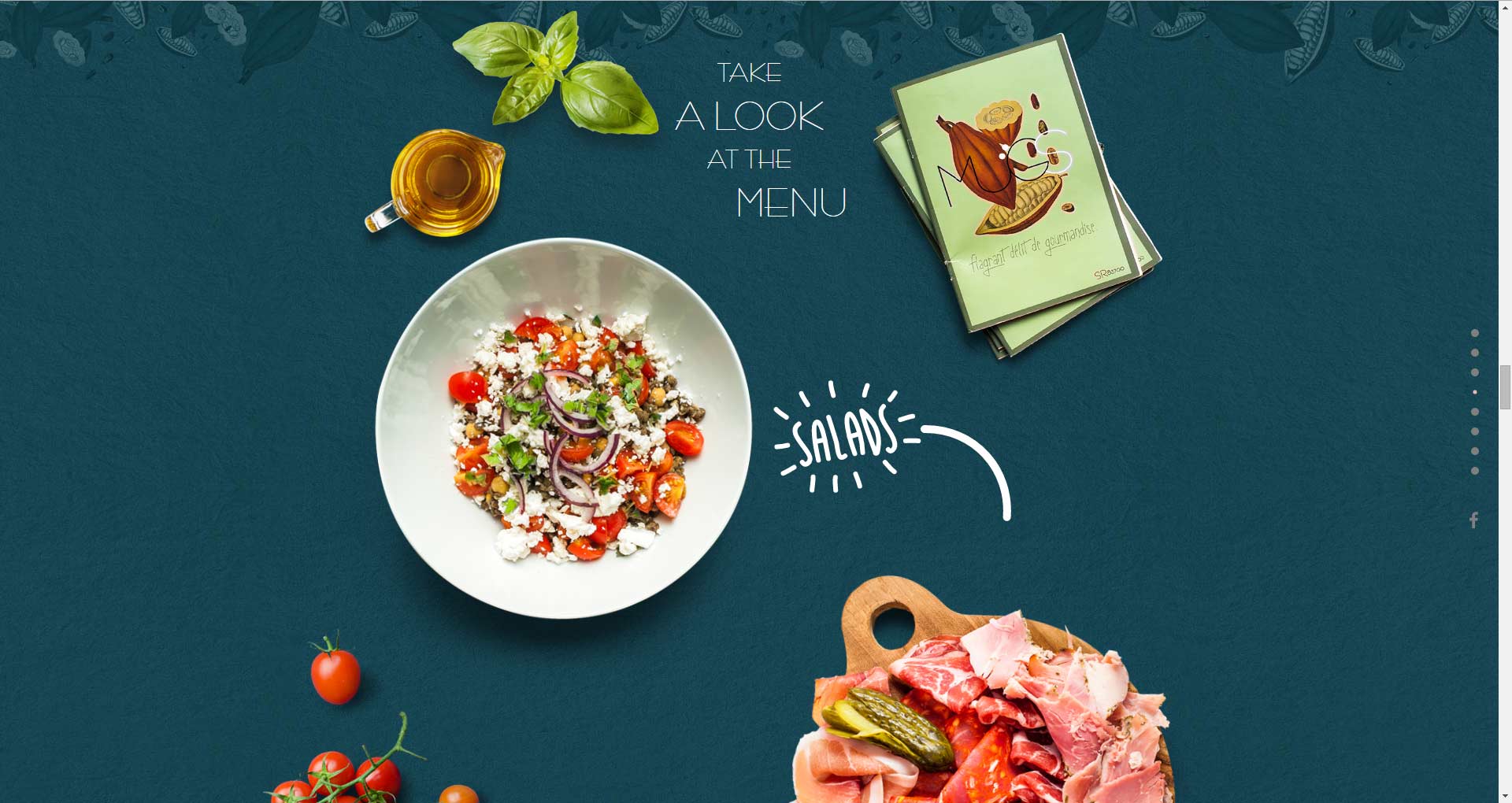
2) Bigger and Better Header Imagery
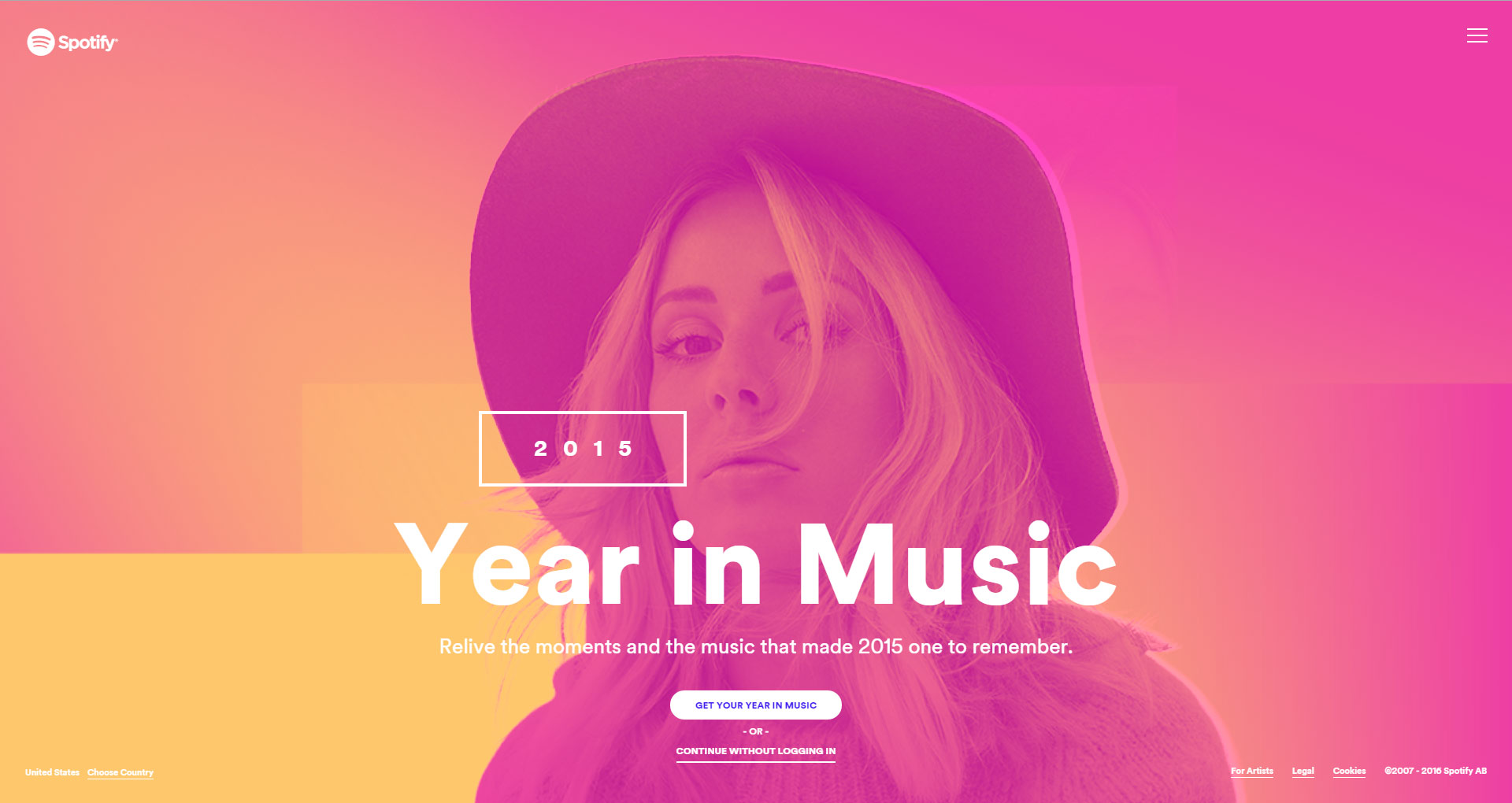
In lieu of a splash page which lost popularity a few years ago, header images paired with some kind of text overlay have just about become the norm. Designers are now aiming for a bolder approach, doing away with smaller header images and aiming for larger hero images or full screen backgrounds which offer a more focused call to action.
Larger hero images have led to bigger and bolder typography as well. Web font services such as Typekit, MyFonts, and Google Fonts allows for unique creative typefaces to be used directly on the site. This fulfills two loves of ours, beautiful typography, and SEO friendly website development. We’re sure dramatic typography will continue to be a huge factor in creative and attention-grabbing header images.
As these images continue to become bigger, better, and more unique, we’ll also see less stock imagery. Stock photography is like a small suburban home, they all look the same. Website owners are using more custom imagery to stand out from their digital neighbors.
As 2016 continues, we’ll be looking forward to more and more beautiful first impressions that include custom photography, custom illustrations, animations (More on that soon), and video backgrounds.
3) Above or Below the Fold, Who Cares
Web pages have grown in length and users are getting used to this. That’s changing how the top section of the website is being used.
This area above the fold has been used by designers to make the all-important first impression since the heydays of newspapers. Because websites are being accessed on more mobile devices, site visitors are forced to scroll almost immediately, losing the impact of above the fold content. Users continue to be comfortable scrolling a significant ways to view the content they desire.
Though the importance of the “above the fold” area will continue to be as a hook with strong headlines and imagery, this is no longer where the most important information on the page will be and the visual separation may continue to fade away. Service content, sales copy, about information, etc. may all find its way to below the fold. Hey, and we’re ok with that. As UI designers, we love negative space, more images, and content that just “flows.”
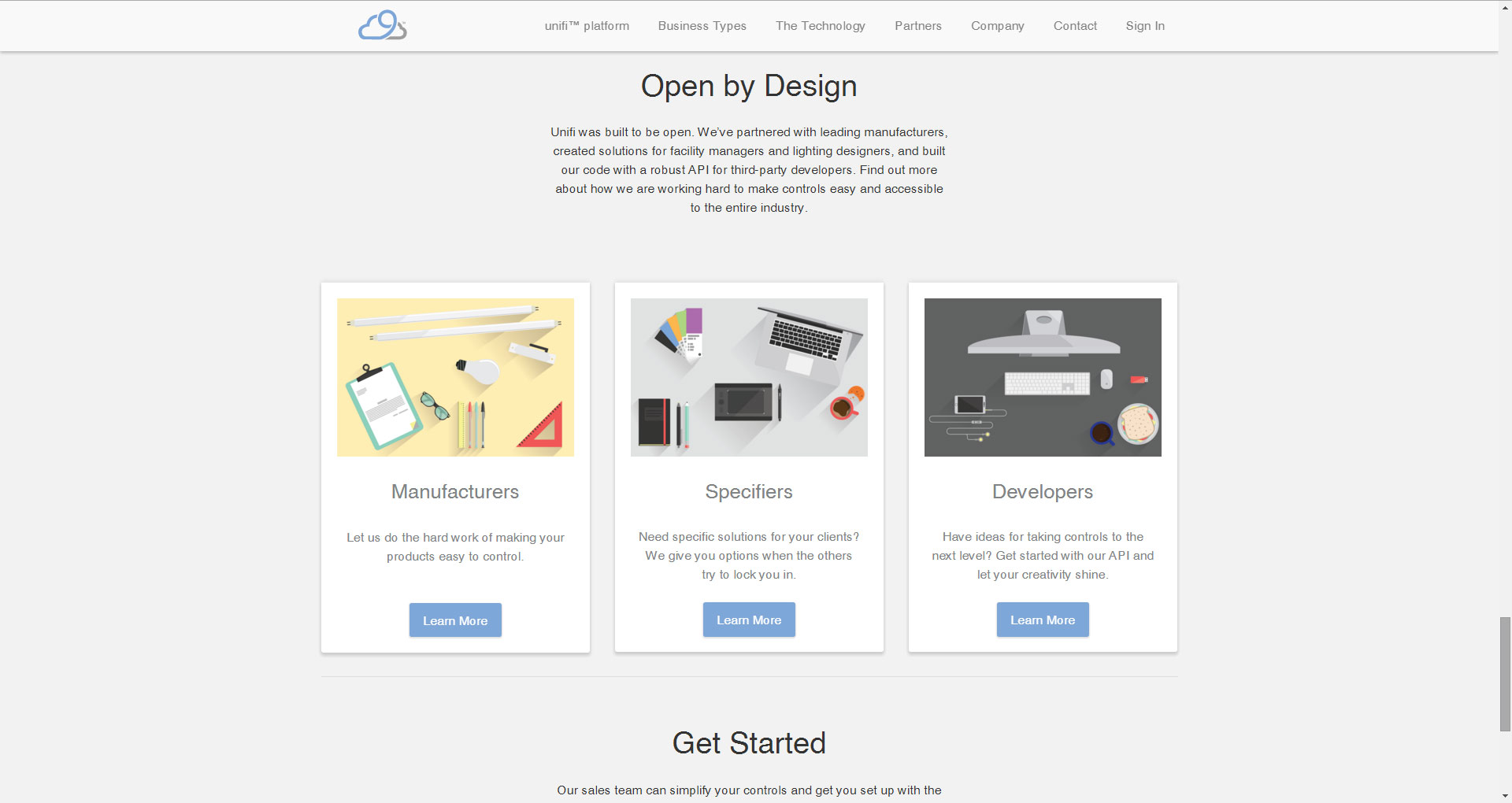
4) Material Design is Flat 2.0 but Less Flat
Google introduced the Material Design language back in 2014 with the release of Android Lollipop as kind of what’s coming next after flat design. (Flat design, you’re so last year)
The design language, originally specified for mobile, was created to provide an interactive user experience to invite the user to move around or access content intuitively. Think subtle shadows that help add realism to the user interface. Buttons that are most important stand out more with larger shadows than card based content that uses a much smaller shadow separating information from the background.
Google created the exact guidelines and specifications for creation of Android apps but many web designers are pushing the limits of the language to expand its usage. There is also a Material Design Lite version that is more suitable for website projects. We’ll probably be experimenting with this design language on an app design project sometime this year.
5) Card Layouts Are Awesome
Pinterest made content more accessible by consolidating information into cards that allowed site visitors to scan and quickly find what interested them. The organized look of the website, with a grid design, relies heavily on images and attention-grabbing headlines.
Interfaces designed using cards is a concept that begun through the creation of our last trend, Material Design. They use subtle shadows and borders to add depth and separate specific content from the background and other page content. They work great for organizing services, displaying events, or presenting media.
With an average attention span of 7 seconds for most users, this trend allows for a vast amount of content to be absorbed extremely quickly. We’ll probably see it expanded to new uses and evolve into new looks this year.
6) Interactive Elements Lead to User Addiction
We as users interact with websites and apps every day. Think about clicking on a world icon adorned with a red circle and a white number for the amount of unread messages or comments you have. Millions of users do this on Facebook daily. Or how about scrolling through the last weeks’ worth of Instagram posts. Users don’t simply look at these images, they like and comment until their blue in the face.
Interactive elements allow the user to participate actively in the website experience instead of passively taking in information. They become part of your daily routines and help create a user experience that is more personal and in some cases, addicting.
This is why we build in multiple call to actions, slide out navigation bars, filter and sorting for data, and many other features into our interfaces. Though interactive components are already widely used throughout mobile and web applications, we expect this trend will continue to grow on websites in general.
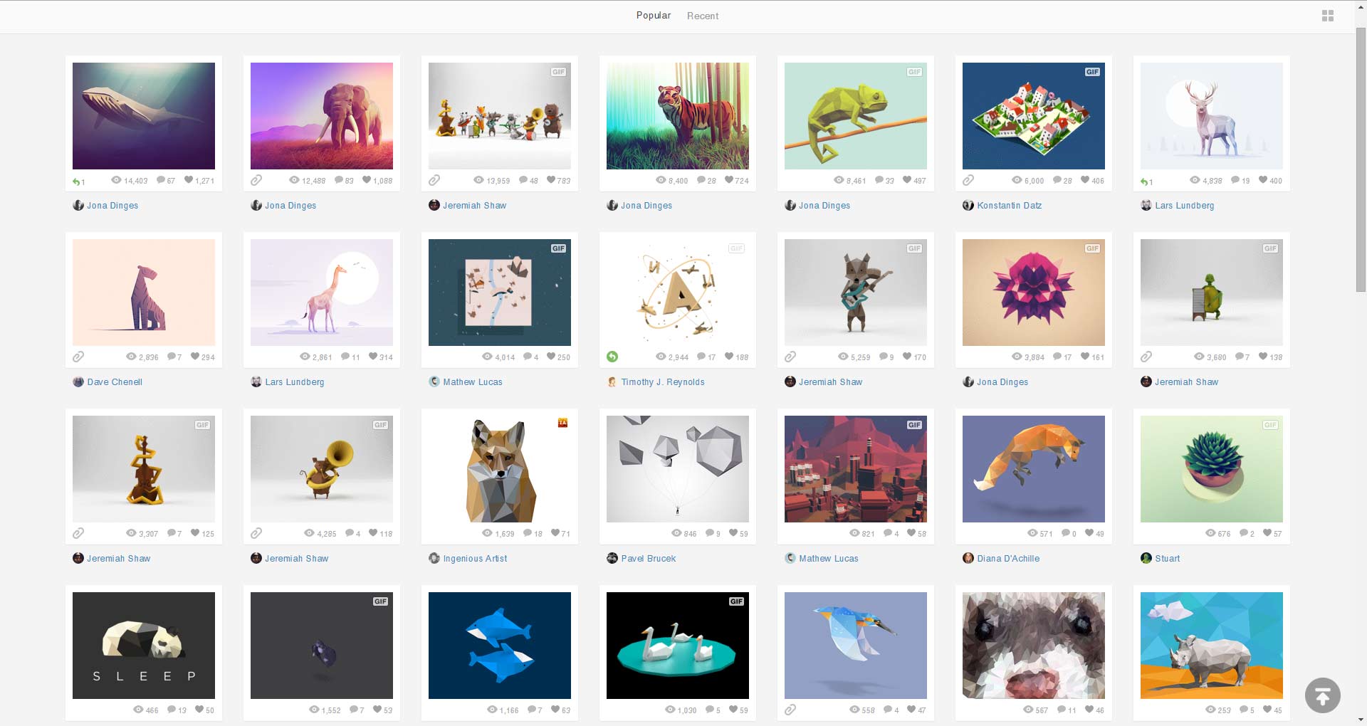
7) Illustration and Animation Add Smiles and Excitement
Huge on-scroll animations and illustrated background images have been popular for a few years now. This is not changing. Subtle illustrations and animation to add detail and increase engagement is a trend that’s increasing in popularity with every scroll.
Illustration, built into a website design especially, can create a stunning effect while conveying a message in a visually interesting way that other imagery like photography just can’t do.
Animations take this concept to a different level and when combined with interactions, create a unique and immersive user experience.
There are two types of animations. Animation as content and animation as UI elements. “As content” includes your parallax webpages and fancy content transitions. “As UI elements” are your more subtle animations such as dropdowns, slide outs, hover animations, loading bars, and little effects such as a hamburger menu animating into a close button.
Illustration and these animation effects can be layered together to form a bold and consistent user interface but there’s also a point where there’s too much of a good thing. Remember to be purposeful in design with the user (“customer-centric”) and the end goal in mind.
Trend well
Now, forget everything we’ve just told you and go be as creative as you want. Trends are useful in that they give us guidelines for our projects and help identify standards. They however shouldn’t be thought of as rules or even the best solution all the time.
Focus on the user. They’re the only trend that really matters.
If you’re embarking on an adventure into web or mobile, we should probably chat. We’re not just blowin hot air over here, we’re UI designers, developers, and strategists on a daily journey to great user experience and happy customers.
Bon voyage!


