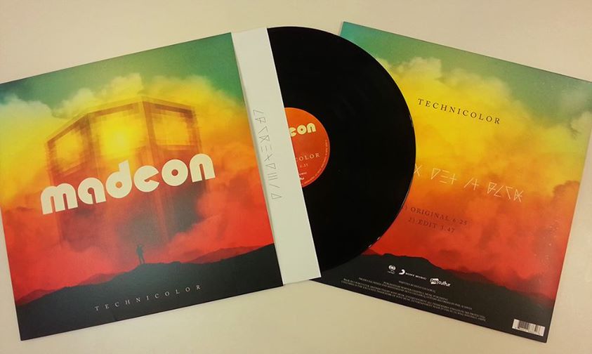
As a creative team, we are inspired daily by the likes of music, but not enough credit is given to the graphic designers who brought us the album’s cover. 2013 no doubt was a pivotal year for some musical heavyweights to drop in, but we dug deep to find the best album covers from artists you may not have heard of.
Potty Mouth – Hell Bent
When Judas Priest was declaring its hellish bend for leather, we knew there was no innocence about it. You might think coming into the year 2014 we would do away with I Spy’s children’s book aesthetics, or maybe even the junkyard charm that hangs on the walls inside a TGI Friday’s. But what we have here instead is a case of collaged irony with whimsical trinkets patronizing the dark undertone of being “Hell Bent”. The arrangement is convoluted yet subtle, certainly veering away from the idea of being iconic to focus on arrangement and a disregard for minimal and controlled forms. 
Carcass – Surgical Steel
In plenty of horror films, we may deal with characters who are brutish in their attacks like the Werewolf, Leather Face from the Texas Chainsaw Massacre, and Chucky. However, on the other side, one notable thing about the maniacal nature of mad doctors is their sheer, calculated approach to horror. While the majority of us aren’t death metal heads, we certainly do appreciate good arrangement. This arrangement perfectly reflects the sound and approach to the genre of music by becoming almost an iconic piece for the band. It certainly irks the viewer in a very visceral way as the artist intended by being that calculated scare tactic. 
Deafheaven – Sunbather
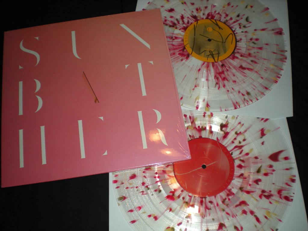
Apparently the guitarist, Nick Steinhardt from Touché Amoré, designed this album with idea of staring at the sun for too long. The color scheme is supposed to reflect the waning vision behind the eyelids while facing our magnificent star. The typeface plays with a great sense of gestalt and balance that just isn’t found on albums these days. 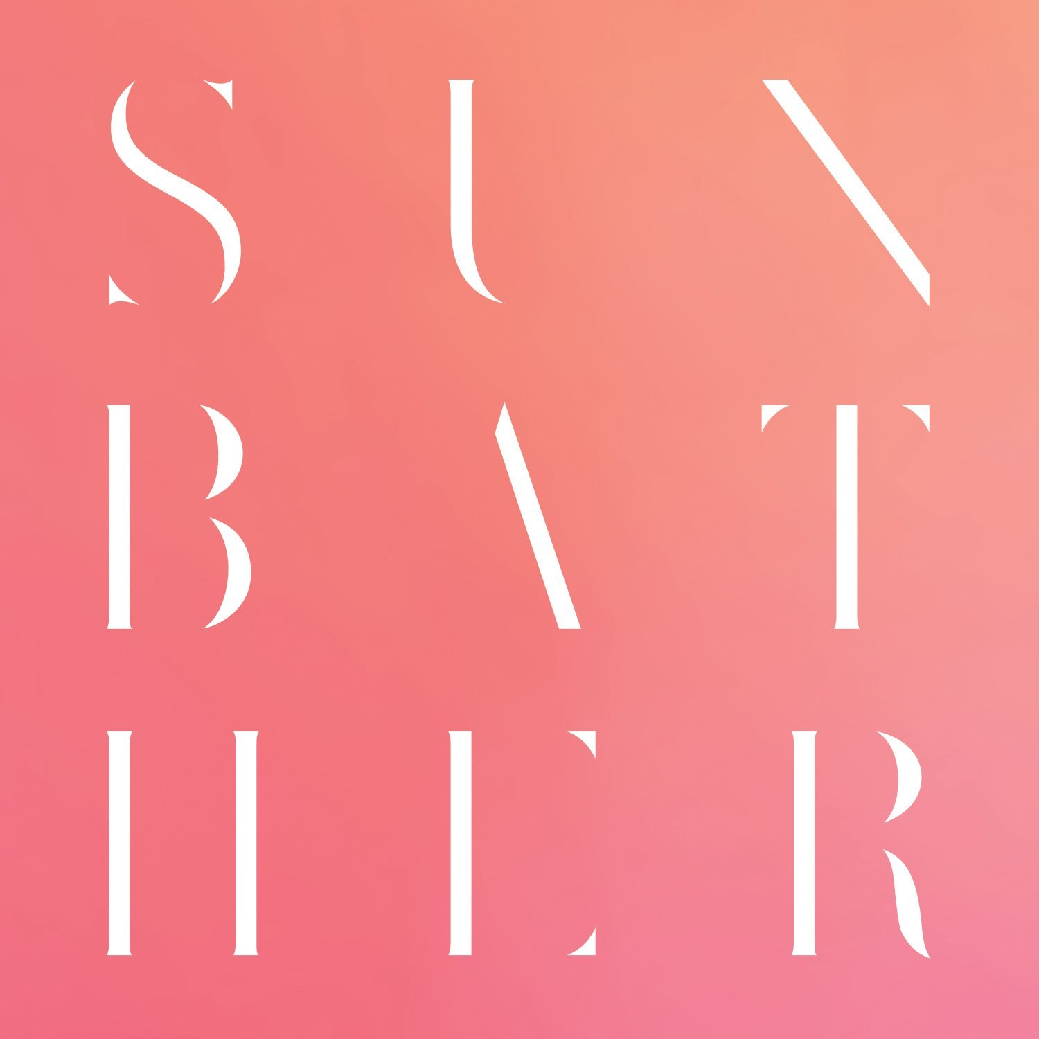 Added bonus! Look at how cool the vinyl is!
Gold Panda – Half of Where You Live
Looks like we’ve got tesseracts, on tesseracts, on tesseracts wonderfully imagined with an excellent color palette. The mathematical complexity of this piece is a perfect onset of the balanced nature of this controlled chaos. The outer shapes mesh together with their grids filled in by even more complex color choice and design that would come across as a tedious nightmare akin to Andy Gilmore’s Hemicube. It just doesn’t get better than this. 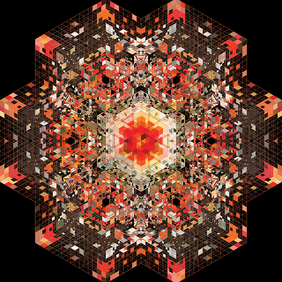
Polvo – Siberia
Not everyone can pull off a dark garage band, but Polvo sure does. They’re as grungy and wonderfully complex as the cover lets on without being ominous. There are some demerits to be given for the typeface and color chosen for the album title below, but we’re feeling lenient. Happy Holidays, right? 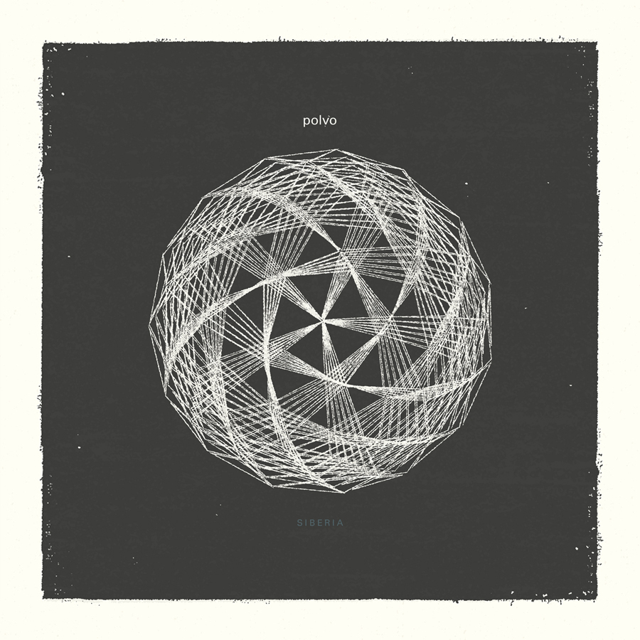
Kurt Vile – Walkin’ On A Pretty Daze
Probably one of my most unlikely picks is Kurt Vile’s seemingly juvenile attempt here. I can’t help but feel that this is a perfect reflection of Kurt Vile’s attitude toward music to encapsulate an urban and dirty sound. I’ve been debating with myself for a solid three days if the typefaces on the side of the building are painted on or not, but I have a definite feeling a clever designer took the time to represent the letter forms in a shaky way to match the building perfectly. 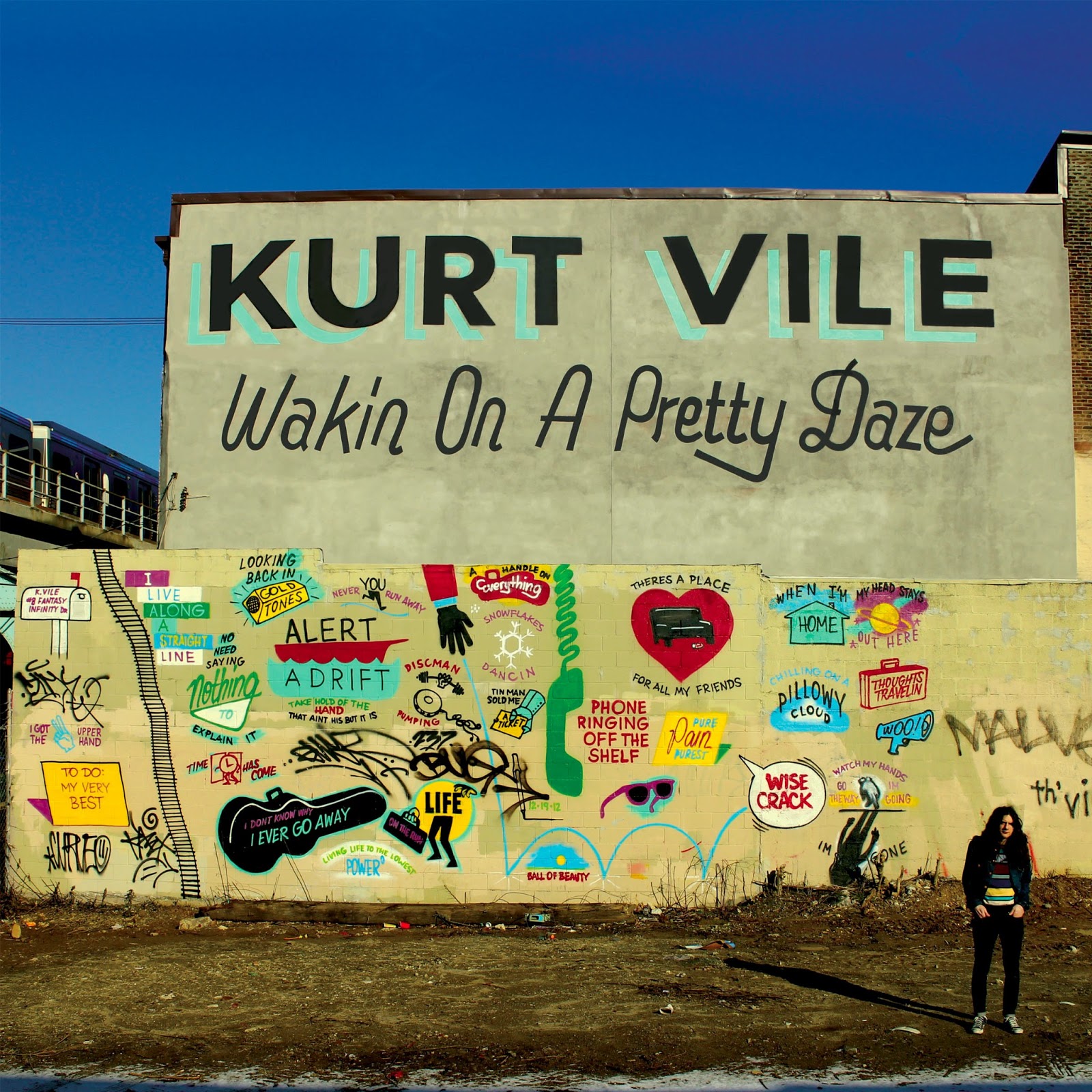
Lustmord – The Word As Power
An almost cultish gem, Lustmord’s The Word As Power might reek of old design captured in what is possibly the Occult’s lesser published works, but we can’t say that for sure. In any sense, the balance employed is not without its messy nature of other designs and artifacts found throughout the cover that make it an interesting visual treat similar to Gold Panda’s Half of Where We Live but with spiritual spin. 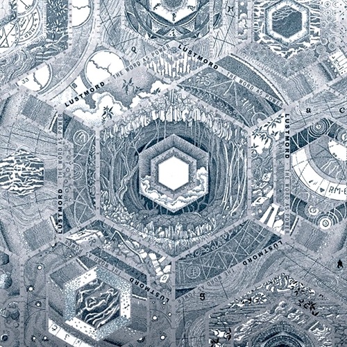
J. Cole – Born Sinner
I have to hand it to J. Cole. Between his excessive name-dropping and solid production team, it’s a wonder why he chose a generic pop artist cover for his last album. It’s good to see he chose something simple and iconic. The statuesque figure represents J.Cole as a black man with the stylistic choice of adding pronounced ears and of course the color chosen for the figure. The above crown denotes an ironic halo, bringing on the power of owning his sins or being the king of his transgressions. It perfectly reflects the albums title and the music involved. 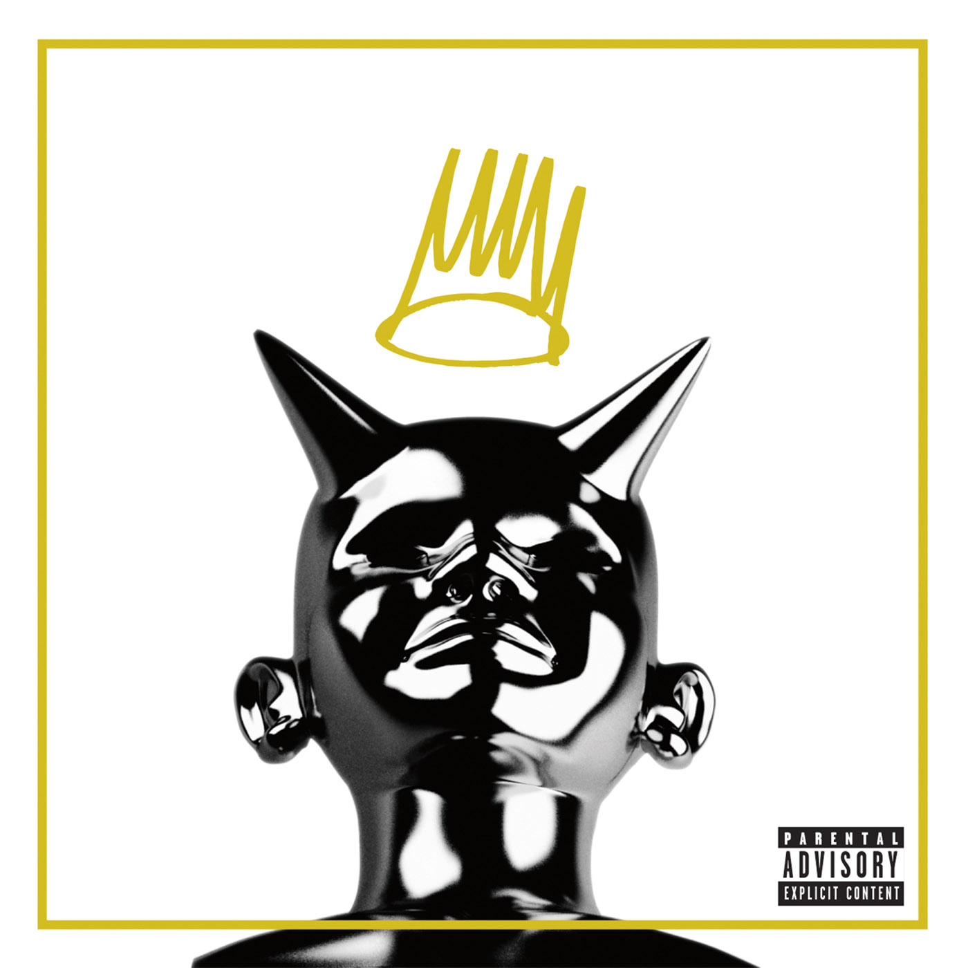
Madeon – Technicolor
It was under our creative director’s pick to choose this cover. Who can say what the resplendent figure emerging from the clouds is, but by that very mystery we’re left wondering in a good way. The above pixelation in the windows hints at the digital aspect of the music so prevalent in Madeon’s works. The blended choice colors give this album a warm presence of space and time giving me a wonder as to where the man is standing. Is he in the dessert? Is he on the moon? Who can say? Pair this with a tasty, thick typeface that gives the impression of an artist who doesn’t take himself too seriously, but also well-rounded sense of fun and, well, we’re along for the ride. 