All events, no matter the industry, need a professionally designed website. An event’s website design can have a significant impact to the success of your event, especially when you’re looking to build a solid following of fans to convert into ticket sales year after year. That is where lucky designers like myself come in to play.
Creating an Event Website
The first fully custom website I designed was for Podcast Movement in 2015. We knew this website needed to be fun and took advantage of incorporating lots of illustration. It was my first time incorporating illustrations into a website and I was excited to be able to show off my talents. I focused on illustrating the most popular landmarks from Chicago, where the 2015 event was held and transformed them into the homepage’s design to create something truly unique. After our successful launch of Podcast Movement 2015, we developed a knack for event websites completing four more events!
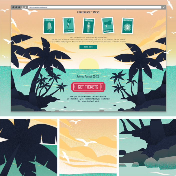
Color, beautiful photography, large text, and fun graphics create an entertaining and compelling event website that excites the visitor pulling them in to learn more. Using an illustration is a popular way to engage the visitor and we have incorporated these designs heavily year after year with each Podcast Movement website. Every version update is an opportunity to illustrate, customize photography, animate, and design something unique that our average corporate client might not be up for.
Not only are these sites fun to look at and navigate, they are so much fun to design.
Evolution of an Event Website
Often, annual events and conferences are known to change location, purpose and content each year. The website should change too with a new or refreshed look to reflect the event’s changes.
This is often more of a re-skin rather than a complete redesign but the purpose is the same. For instance, if the type of content and navigation is roughly the same from one year to the next, the design process remains simple and can be quickly updated. When working with us for an event website, this what we would recommend.
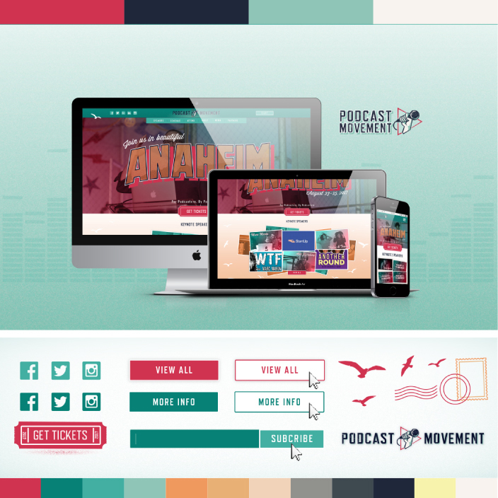
Using Podcast Movement as an example, each update has included slight changes to the navigation, inner pages, and the homepage content. Each year is a growing experience and the website continues to improve from one event to the next, and they can’t get enough of my custom illustrations.
Branding The Event
Like the website’s “skin,” the event’s brand often needs to be just as dynamic. An adaptable and versatile brand and logo that can be easily manipulated year after year is invaluable. This will allow you to fit the logo with new themes and the updates to the event’s agenda and tone.
Maintaining established brand equity is important for pretty much any brand and doing so typically includes consistency with the logo’s design. That doesn’t mean everything must stay the same, but for events I’m determined to make it so!
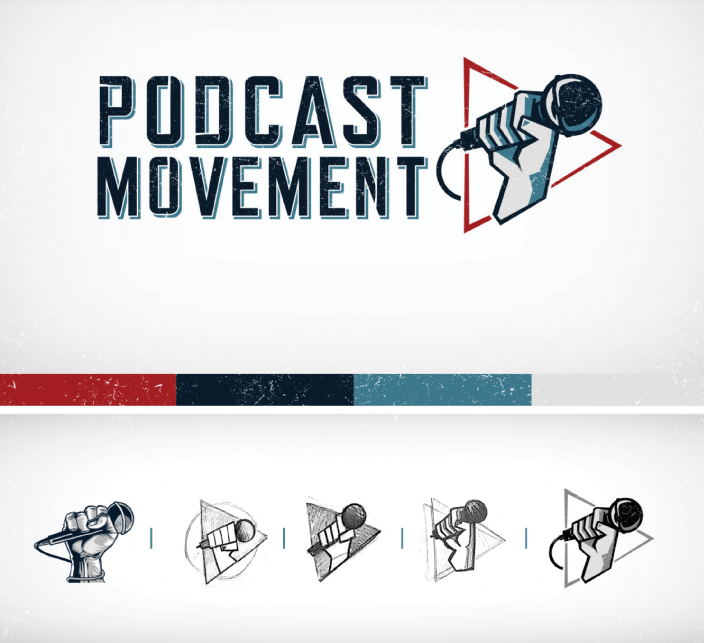
For Podcast Movement, we simplified and stylized the mark, created customized typography and made the hand ambiguous so it wouldn’t be connected to similar imagery of a specific gender or skin color. The result was a logo and brand that had a set color scheme which could adopt any colors set by the following years’ theme.
Like any other brand package we also created several lockups to ensure the logo was versatile. Creating horizontal, vertical, and mark-only logo lockups ensures that the logo can be used in almost any space from a website’s navigation to promotional posters. Between web and print media, consistency is key to having a strong brand and recognizable event.
Additionally, to guarantee consistency we’ve expanded the brand identity to include a specific set of typefaces. It is important for the typefaces to work with the website and in print to ensure everything is inline with the event’s brand.
Building The Website
Regardless of how long the event has been around, the content on the website usually has the same key elements. Calls To Action (buttons) to buy tickets, the location of the event (that’s important), the benefits/features of the event, and the key speakers. More than any fun design or groovy layout, awesome keynote speakers will bring new and previous attendees.
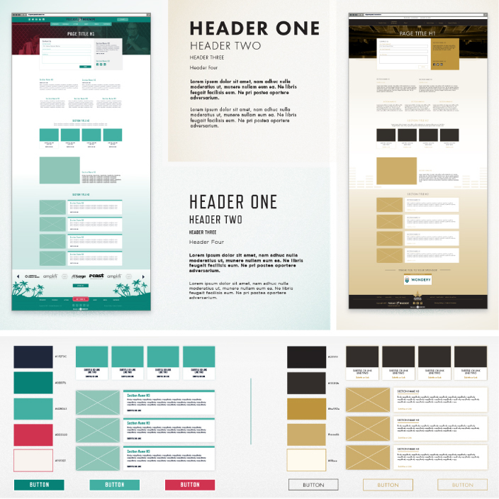
Academy of Podcasters, a sister site to Podcast Movement looks totally different but was built on the same “theme” or skeleton. I created a custom template that could easily be pulled apart and reorganized in modules, this strategy made it easy for us reorganize the content for our yearly updates. And although the skins of the websites look completely different, they are actually laid over the same skeleton.
Our Favorites Event Websites
There are a few websites we look forward to seeing every year for both inspiration and competitive analysis! We’re not saying these websites are perfect but boy are they fun and eye catching.
Here are a few of our favs!
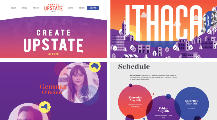
The bold type and animated illustrations are exciting and the sponsored speaker section is long but super original.
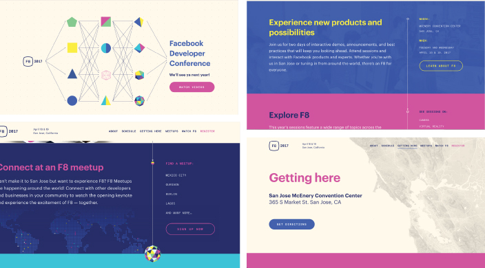
The Facebook Dev conference website is actually very straightforward content layout-wise and the background/surrounding design is fun and original.
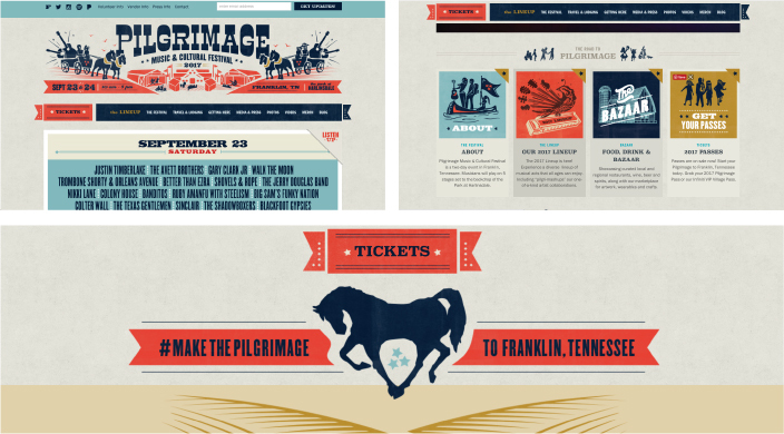
This has been a reference for us since the beginning of Podcast Movement. The overall design is simple yet the look is constant with minimal changes each year.
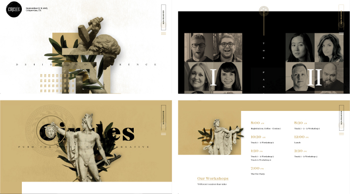
This website is always impressive, and this year’s skin is even more brilliant than the last. Annually changing the look of your website is a challenging task, but they make it seem effortless with this Ancient Greek theme.
Conclusion
Having a fun, eye catching, well organized and a frequently updated website for your industry conference, music festival, local fair “or whatever!” is indispensable to the success of any event.. Strong branding helps solidify the identity of the event and creates confidence in the attendee that they will have a unique and fulfilling experience. Having a strong design team behind an event’s website keeps the design, content and layout looking fresh each year resulting in increasing ticket sales and the attraction of new and returning visitors!
Are you hosting an event and in need of a custom designed website? Tell us about it through our project form here.


