Twenty-Sixteen was another great year for Square 205’s design team, and a great year overall in the design world. There have been many creative ideas from print to the web, and we’ve taken notice.
We’re constantly looking for new inspiration for our own projects, and often discover amazing design work in the process. Therefore, we thought we’d look back at the year and showcase a few of our favorite projects from the design world in 2016.
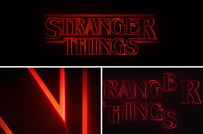
Stranger Things
This Netflix original was a masterpiece in understanding the era in which the series is set and depicted it perfectly. From the music to the typography and light effects, viewers were instantly taken back to Steven King’s 80’s era. And all of that is just within the title sequence. Don’t get us started on the actual show itself (freakin’ awesome)!
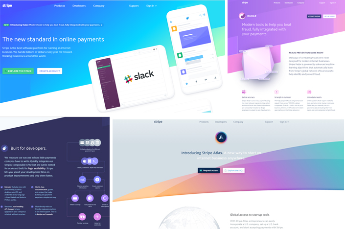
Stripe.com
This website captured our full attention with its cohesive look throughout. Stripe takes advantage of several of today’s popular design styles; soft color gradients, mono-weight icons, and open space, but with a delicate balance that doesn’t make the elements overwhelming. With touches of 3D graphics and animation used in key sections, Stripe.com is a pleasant website to experience.
The Radar section (under Products) is a great example of this site at its best.
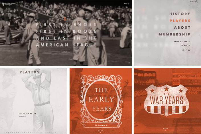
The St. Louis Browns Historical Society
What happens when sports, history, and great UI/UX meet? The St. Louis Browns Historical Society website. Telling the story of St. Louis’ favorite underdog baseball team, the website relies on historical photography. These photos fill the screen beautifully while creating the background texture for each page. With the addition of solid typography and subtle touches of parallax and vintage video flicker on still photography, it becomes a joy to journey through the historic chapters of the St. Louis Browns’ story.
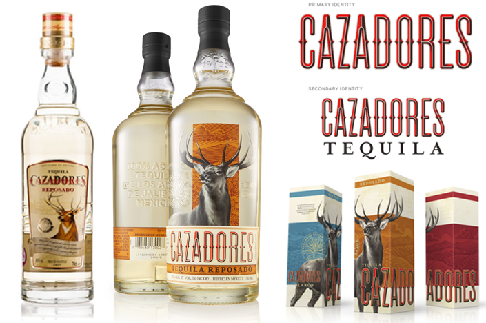
Cazadores Tequila
Let’s talk about packaging. Cazadores Tequila updated their branding in a way that looks fresh, but doesn’t lose the spirit of the original bottle. The deer is a more graphic representation than before, while the typography is modernized as well, creating a cohesive look that is the Cazadores brand.
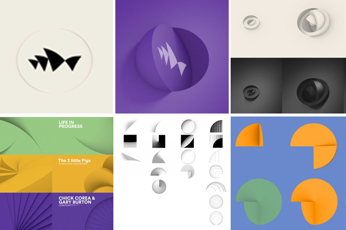
Sydney Opera House Motion Identity
When it comes to branding, we came across the Sydney Opera House and their new motion identity. There’s so much to say about how simple and effective the final product is. However, we decided it would be best to let the motion identity video do the talking.
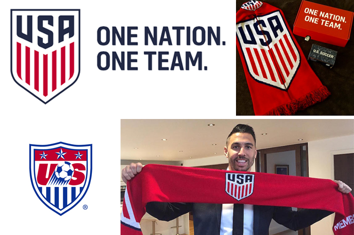
USA Soccer
The U.S. is finding its place in the soccer world with MLS and both men’s and women’s national teams’ recent success. So it was time for a fresh take on the team logo, and they nailed it. When rebranding, they took a modern design approach of stripping down marks to their simplest forms. This almost appears to be a gamble when compared to current design styles in American sports. However, it brings to the forefront the essence of the USA with red, white, and blue, giving a subtle nod to the country flag. Additionally, they worked within the traditional type of shield composition known in the world of soccer.
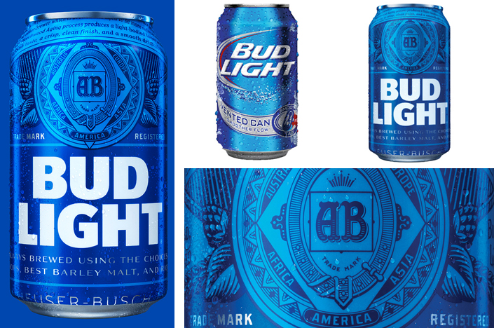
Budlight
What once was new is now old, and what was once old is now new. The evolution of beer cans – mainstream brands in particular here – found their styling on market appeal, and it’s not uncommon to find Bud Light in the hands of many football fans tailgating on Saturday and Sunday mornings in the fall. But now, as Bud Light is working to appeal to a younger generation, and the new, slick motion type and graphics give way to a vintage design. The use of the Anheuser-Busch turn-of-the-century design in tone-on-tone blue lays the groundwork for the design, while the type has been simplified in upright san serifs.
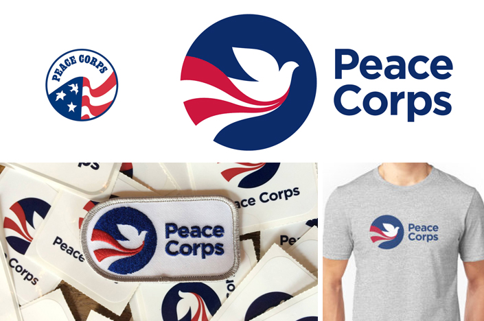
Peace Corps
Over some 200,000 people have worked with Peace Corps since its inception in 1961, helping to broaden the horizons of college-aged American youth in countries of need, and build strength for its name. Yet, the Peace Corps’ mark has fallen short in its evolution until now. The new mark finds the spirit of the corps, by removing the odd transitional marks of the stars/dove from the flag and making it the focus of the design hierarchy. The flag is still represented well in the swooping movement of the red and white stripes under the dove; all tucked nicely into a circular field of blue. The clean san serif type used allows the logo to shine.
DC Comics
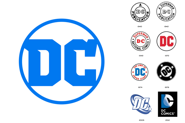
Because there are one too many comic book fans in our office, the DC Comics logo was a favorite brand redesign, though the last three iterations of the logo can be debated. The current design and the two previous are all quite different and can stand alone in their own way. But, the consensus at Square 205 is generally positive towards the throwback to the circular badge designs from 1940 – 1977, with the current being most similar to the 72-74 design. The color, the type, and badge composition take us back to classic DC comic books – and it just feels right.
Design Disruptors
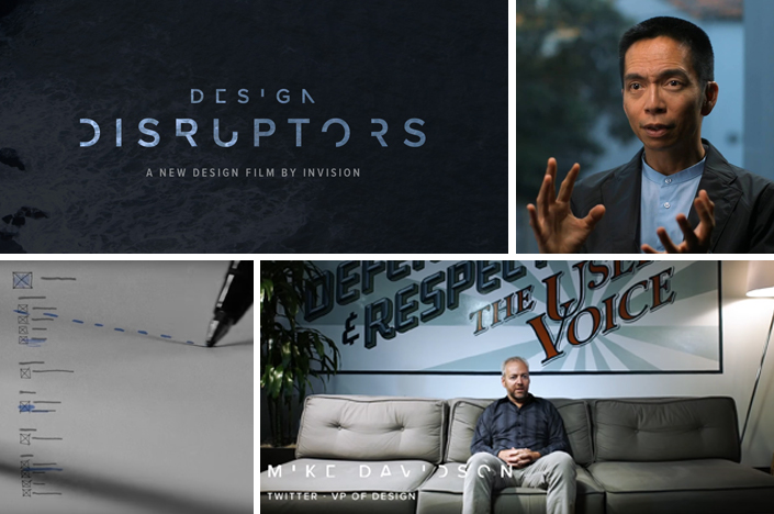
Finally, we close with something that is a personal favorite of the design team: Design Disruptors. We were lucky enough to attend a screening of this 2016 InVision film, hosted by Dallas Society of Visual Communications, and we found it inspiring.
Whether you’re a veteran or fledgling UI/UX designer, or even a non-designer, this film will hook you. It offers a voice to the current state and need of design and how it interacts with our lives in the physical and digital sense. With appearances from notable designers and thought leaders in the design field, you’re left in awe of what it takes to be and think like a designer.
Let Us Create an Unforgettable Design for You!
Love these designs? Check out our work. Love our designs? Contact us! Our excellent design team can help create something unique and meaningful for you brand.
Did our post inspire your inner designer? Follow us on Facebook and Instagram for more inspiration.
Cheers to a great year in 2017!
– The Square 205 Design Team


